What actually makes a website beautiful?
A beautiful website does more than look good. It balances visual appeal with clear purpose, intuitive navigation, and brand consistency so that every design choice serves the visitor, not just the designer’s portfolio. According to UI/UX mentors at Eleken, the same rigor applied to SaaS dashboards and onboarding flows produces marketing sites that feel clear, engaging, and high-converting.
The core elements that define a visually appealing site:
- Responsive design that preserves layout integrity across every screen size
- Compelling typography with clear hierarchy guiding the reader’s eye
- Purposeful color that reinforces brand identity and directs attention
- Intuitive navigation so visitors find what they need without friction
- Multimedia integration that adds depth without slowing load times
- Brand alignment so every visual decision reflects a consistent identity
Ignoring the balance between aesthetics and usability produces sites that look impressive in screenshots but fail to convert visitors into customers.
Table of Contents
- 12 stunning website designs worth studying in 2026
- Design trends shaping gorgeous sites in 2026
- Architectural principles that hold beautiful sites together
- What “beautiful” actually means in web design
- How color theory shapes web aesthetics
- Typography choices that lift a site’s visual quality
- Imagery and multimedia that create real visual impact
- Key Takeaways
- Cloudsprout builds beautiful sites without the agency overhead
12 stunning website designs worth studying in 2026
The examples below appear on Awwwards and Siteinspire and represent a range of industries, visual styles, and UX strategies.
“Great web design is more than aesthetics. It’s about crafting immersive experiences that engage users, communicate brand identity, and enhance usability.” — Eleken senior UI/UX designers Dmytro Shkliaruk and Darina Silchenko
- UNITED24 Rebuild Map — Uses real-time data visualization to turn a serious subject into an emotionally resonant, interactive experience. The restrained color palette makes the data the hero.
- Lusion — A motion-first portfolio that uses WebGL and smooth scroll to create depth without overwhelming the content.
- Cohere — Clean AI branding built around product-first storytelling, where every section answers a specific buyer question before the visitor thinks to ask it.
- Notion — Minimalist productivity design with personality. The sparse layout trusts the product to speak.
- Superhuman — Soft gradients and calm ambient visuals communicate speed without visual noise.
- Mintlify — An aurora-inspired UI for developer documentation that makes technical content feel genuinely inviting.
- Affinity — Bold black hero with museum-style typography. The restraint in color makes the product imagery land harder.
- Lattice — Soft, trust-driven HR design with calm colors and friendly UI cards that reduce the perceived complexity of the product.
- Origin — Elegant financial design using cinematic gradients to signal premium positioning without a single stock photo.
- LottieFiles — Motion-first design with playful character illustrations that match the product’s core promise.
- Typeform — Polished editorial UI with a strong AI-focused message. The layout earns attention before asking for a click.
- Grok — Futuristic dark UI with cinematic energy effects that make a crowded AI category feel genuinely distinct.
Pro Tip: When studying these examples on Awwwards or Siteinspire, note the above-the-fold section first. The best sites communicate their core value within three seconds, before any scroll.
Design trends shaping gorgeous sites in 2026
Awwwards identifies three dominant trends driving beautiful website design this year: vibrant multi-colored gradients, variable typography, and immersive parallax scrolling.
- Multi-colored gradients carry emotional weight. A warm amber-to-coral gradient reads differently than a cool teal-to-indigo one, and the best designers use that difference deliberately rather than decoratively.
- Variable typography lets a single font file respond to scroll position, viewport width, or user interaction. The result is text that feels alive rather than static.
- Parallax scrolling creates narrative depth by moving foreground and background elements at different speeds, turning a page into a story with pacing.
- Hover states and subtle animations make a site feel responsive to the visitor. The Webflow design team notes that interactive elements like hover states and animations increase memorability and perceived quality, especially for tech-focused brands.
Many teams still rely on outdated layouts that make their sites feel slow relative to user expectations. The shift toward product-first storytelling is a direct response to that gap.
Design longevity matters here too. A website typically needs a refresh every 2–3 years before it starts looking dated against competitors who have adopted newer trends. Redesigning too frequently, though, erodes brand recognition.
Architectural principles that hold beautiful sites together
Purpose comes before aesthetics. The Webflow team puts it plainly: beautiful websites start with a clear understanding of who the audience is and what they need. Design trends must serve relevant content, not replace it.
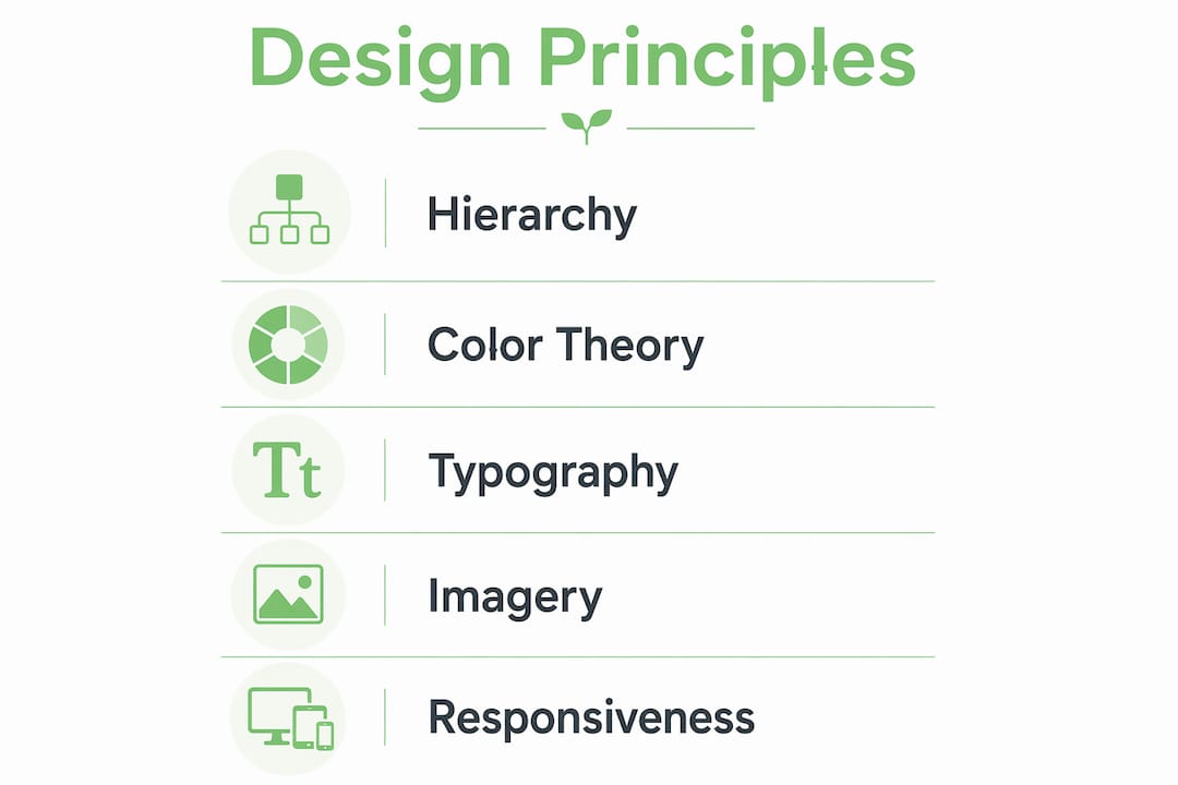
From there, four principles do the structural work:
- Clarity — reduce visual clutter so important elements stand out without competition
- Consistency — unify fonts, colors, and interaction patterns across every page
- Visual hierarchy — guide the eye with size, spacing, and contrast so visitors read in the intended order
- Accessibility — sufficient color contrast and readable type sizes serve everyone, including users with visual impairments
Responsive design is not optional. A layout that breaks on mobile undermines every other design decision, regardless of how polished the desktop version looks.
Common mistakes that reduce perceived beauty include overloading the hero section with competing CTAs, using too many typefaces, choosing colors for personal preference rather than brand fit, and neglecting page speed. A visually stunning site that loads slowly will lose visitors before they see the design.
Want this working in your business — without doing it yourself?
Start a Project →What “beautiful” actually means in web design
In web design, beauty is a functional quality, not a decorative one. A site is beautiful when its visual choices reduce cognitive load, build trust, and guide the visitor toward a goal. That definition separates genuine design from decoration.
The Webflow team frames it well: a website’s beauty depends on addressing visitors’ intent with relevant content and clear design choices. Flashy visuals that obscure the message are the opposite of beautiful, regardless of production value.
How color theory shapes web aesthetics
Color does three jobs on a website: it sets emotional tone, directs attention, and reinforces brand identity. The 60-30-10 rule (dominant color, secondary color, accent) gives designers a practical starting point for palette balance without producing monotony.
Warm palettes (amber, coral, terracotta) signal energy and approachability. Cool palettes (navy, slate, teal) communicate reliability and precision. Neutral backgrounds let accent colors carry more visual weight. Contrast ratios matter for accessibility: the Web Content Accessibility Guidelines (WCAG) set a minimum 4.5:1 contrast ratio for body text, a standard that also happens to make text easier to read for everyone.
Link branding extends color consistency beyond the page itself, reinforcing brand recognition at every digital touchpoint.
Typography choices that lift a site’s visual quality
Type is the most-read design element on any page. A clear typographic hierarchy (a dominant display size, a readable body size, and a supporting caption size) does more for perceived beauty than any decorative font choice.
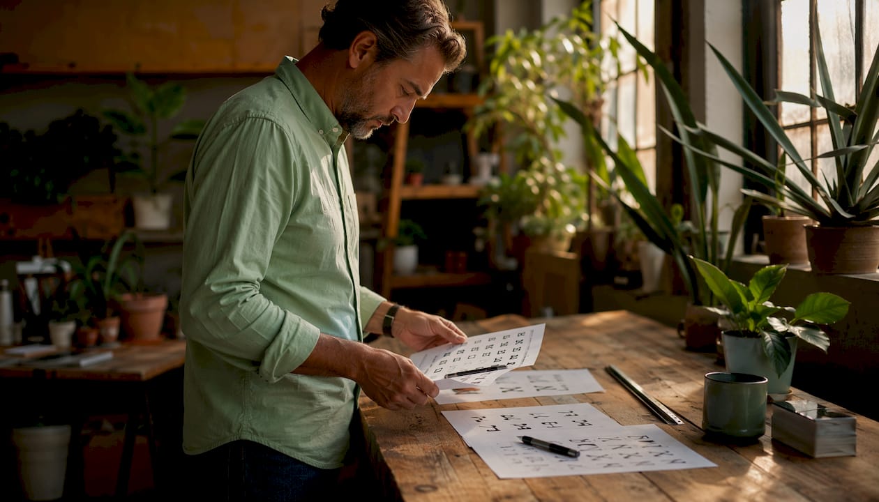
Serif typefaces carry authority and tradition. Sans-serifs read as modern and approachable. Variable fonts, as noted in the 2026 trends above, add responsiveness. The practical rule: limit a design to two typefaces, pair a display font with a workhorse body font, and let spacing do the heavy lifting. Generous line height and ample white space make body copy feel effortless to read rather than dense.
Imagery and multimedia that create real visual impact
Photography, illustration, and video each carry different emotional registers. Original photography builds trust in a way stock images rarely can. Custom illustration signals brand personality and differentiates a site from competitors using the same asset libraries.
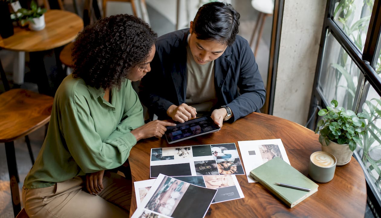
Video backgrounds work when they are short, looped, and muted by default. They fail when they slow page load or distract from the primary message. The best use of multimedia on a site is purposeful: every visual asset should either explain something the text cannot or create an emotional response that supports the conversion goal. When in doubt, a strong still image with thoughtful composition outperforms a busy video.
Key Takeaways
A beautiful website earns its appeal by aligning visual design with clear purpose, consistent branding, and responsive behavior across every device.
| Point | Details |
|---|---|
| Beauty serves function | Visually appealing design only works when it reduces friction and guides visitors toward a goal. |
| Refresh regularly | Sites risk looking dated against competitors if not updated to keep pace with design trends, per design experts. |
| Trends to apply in 2026 | Multi-colored gradients, variable typography, and parallax scrolling are the leading aesthetic drivers this year. |
| Typography and color are structural | A clear type hierarchy and a disciplined color palette do more for perceived beauty than decorative choices. |
| Cloudsprout builds to these standards | Cloudsprout’s in-house team designs custom, responsive, brand-aligned sites with no outsourcing and no lock-in contracts. |
Cloudsprout builds beautiful sites without the agency overhead
Most small and mid-sized businesses face the same problem: they want a site that looks like the Awwwards examples above but can’t afford a boutique agency’s retainer or timeline. Cloudsprout is the direct alternative. The Ontario-based team handles custom website development entirely in-house, from brand alignment and responsive layout to SEO-friendly code and accessibility, with no outsourcing at any stage.
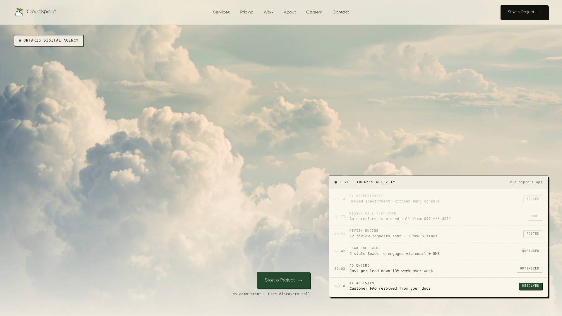
Every project starts with a free digital audit so you know exactly where your current site falls short before a single design decision is made. Month-to-month pricing and no lock-in contracts mean you stay because the work is good, not because a contract says so. Book your free audit at cloudsprout.ca and see what a site built to 2026 standards actually looks like for your business.
Recommended
Less reading. More growing.
We build the systems these articles describe — websites, AI follow-up, reviews, automation — and run them for you.
Keep reading