

Your website gets visitors, but the phone stays quiet and the contact form sits empty. That is almost never a mystery. Visitors arrive, can’t tell in a few seconds what you do, what to click or why they should trust you, and leave. Below is how to find out which of those it is, and how to fix each one without rebuilding everything.
The quick version: a “conversion” is any action that moves a visitor toward becoming a customer. A call, a quote request, a booking, a newsletter signup. If your site isn’t producing those, the cause is usually one of three things: the wrong visitors, a confusing page, or not enough trust.
TL;DR
- First decide whether you have a traffic problem or a website problem. Plenty of visitors and almost no enquiries points to the site, not to reach.
- The usual culprits are a vague headline, too many buttons, no clear next step, a slow or awkward mobile experience and no proof that real customers are happy.
- Put one main action on each page, say it plainly, and place reviews and examples right beside it.
- Change one thing at a time and give it a few weeks before judging, or you won’t know what worked.
- Count more than sales: calls, form fills, bookings and direction requests are all conversions.
Table of Contents
- Why isn’t my website getting leads?
- What counts as a conversion, besides a sale?
- Why am I getting clicks but no conversions?
- The 7 most common reasons a website doesn’t convert
- How do I check my website on a phone?
- A 30-minute self-audit you can do today
- How do I know if a change worked?
- Quick fixes by business type
- Our perspective
- Want a second pair of eyes on your site?
- The one-minute takeaway
- FAQ
- Sources
Why isn’t my website getting leads?
Start with a simple sorting question: how many people actually visit, and what do they do next?
One agency write-up on telling a positioning problem from a traffic problem puts it this way: if a site has meaningful traffic and almost no enquiries, the issue is positioning or conversion rather than reach. If it has almost no traffic at all, the traffic explanation deserves more weight. It also points out that a few hundred monthly visitors will produce only a handful of enquiries even when the site is working well.
That gives you a practical way to sort your situation:
| What you see | What it likely means | Where to look first |
|---|---|---|
| Very few visitors, and the few who come do act | Not enough people know you exist | Local search, Google Business Profile, content |
| Lots of visitors, almost no calls or forms | The page isn’t convincing or clear | Headline, call to action, trust, mobile |
| Lots of clicks from ads, no enquiries | The ad promise and the page don’t match, or the wrong people click | Ad wording, landing page, targeting |
| Enquiries arrive but they’re poor fits | The message attracts the wrong audience | Who you say you serve, pricing signals |
Be honest about which row sounds like you. Buying more traffic for a leaky page is the most expensive way to find out you had a page problem.
What counts as a conversion, besides a sale?
Many Ontario trades, clinics and professional firms never sell anything online. Their website still has a job. Your conversions might be:
- A phone call from a mobile visitor tapping your number
- A quote or estimate request form
- A booked appointment or consultation
- A request for directions to your shop or restaurant
- An email signup for people who aren’t ready to buy yet
- A download, such as a price guide or checklist
Pick the one or two that matter most to your business and write them down. If you can’t say what the website is supposed to make people do, visitors can’t guess either.
Why am I getting clicks but no conversions?
This is the most frustrating version, because you are paying for the visit. Three causes show up again and again.
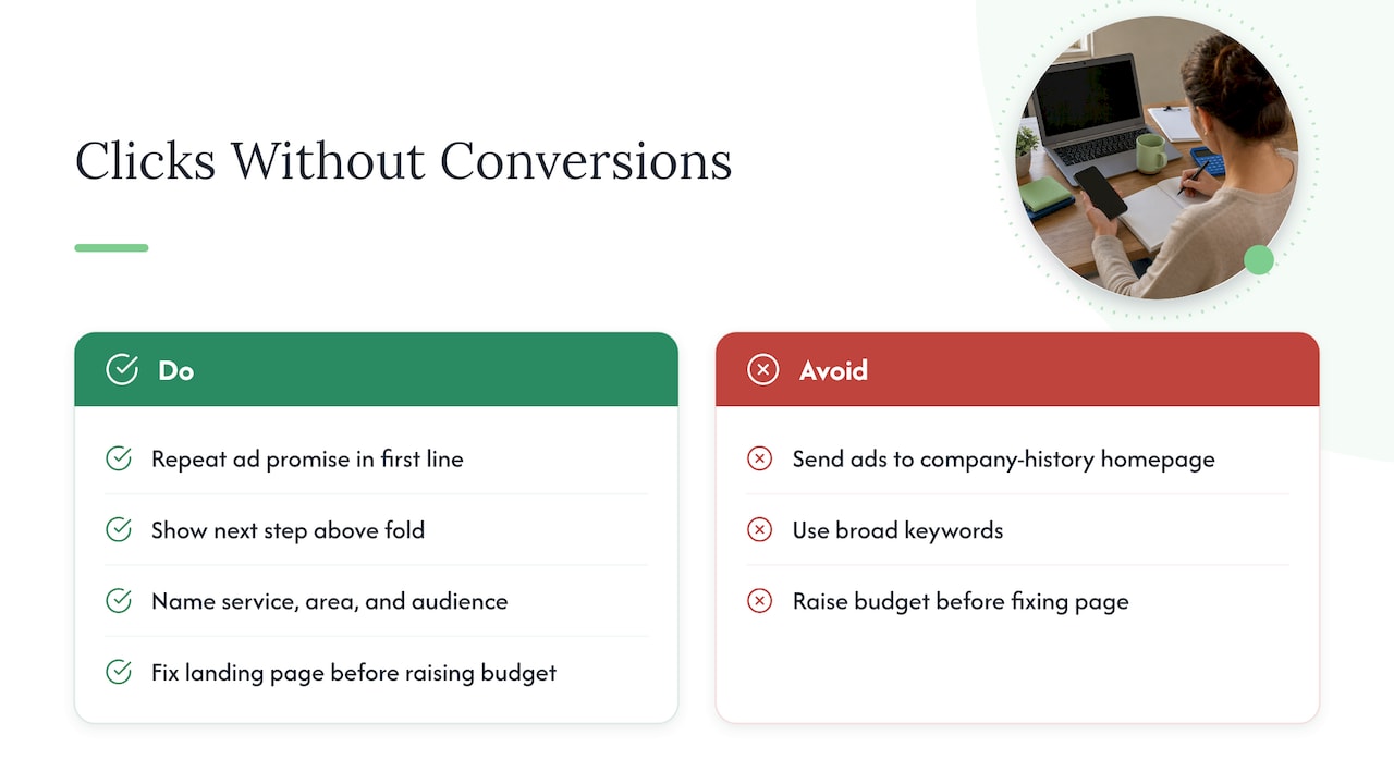
The page doesn’t match what the ad or search result promised. If someone clicks “emergency furnace repair in Hamilton” and lands on a homepage about your company history, they have to hunt for the answer. Most won’t. Send each ad to a page that repeats the promise in its first line and shows the next step above the fold, meaning without scrolling.
The wrong people are clicking. Broad keywords bring curious browsers, not buyers. If your ad reaches people who want a free DIY tip, a quote page won’t move them. Tighten the wording so it names the service, the area and, where it makes sense, who it is for.
The page is hard to use on a phone. Many local searches happen on a mobile device. We cover what to check below.
If you are running paid ads and see this pattern, fix the landing page before you raise the budget. If you are unsure whether you need a blog post or a focused landing page for a given goal, our 3-step decision on blog versus landing page walks through it.
The 7 most common reasons a website doesn’t convert
1. Visitors can’t tell what you do in five seconds
A headline like “Quality solutions for all your needs” says nothing. A headline like “Licensed electricians serving Barrie and Simcoe County, same-week quotes” says who, what and where. Read your homepage as a stranger would: what do you do, who is it for, and what should I do next? If any answer takes effort, rewrite the top of the page. If you struggle to put it into words, our messaging framework for saying what your business does helps.
2. There are too many choices
A page with six buttons, three offers and a pop-up asks the visitor to do the thinking. One commentator on small-business conversions argues that sites fail when too many options create decision paralysis, and visitors facing a pile of buttons end up clicking none. Give each page one main action, such as “Get a free quote”, and make it the most visible thing on the page. Secondary links can exist, but they shouldn’t compete.
3. The next step is unclear or buried
A call to action should be a verb the visitor understands: call, book, get a quote. Put it at the top, repeat it after each major section and in your header on mobile. Keep forms short. Every extra field is another reason to quit, so ask for name, contact method and a short description, then follow up for details.
4. Nothing shows that other people trust you
A stranger deciding whether to hand you money or let you into their home wants proof. Reviews, testimonials, short case study snippets and client logos placed near the main button can noticeably lift conversions. Add your Google rating, a photo of the real team, your licences or memberships if you hold them, and one specific result in a customer’s words. If you have good jobs but no write-ups, our guide on turning one interview into four assets shows a simple way to capture them.
5. The content talks about you, not about them
The Business Development Bank of Canada advises that website content should be helpful to prospective customers, focused on their wants and needs rather than only promotion. Swap “We are a family-owned company founded in 1998” for what that means to the customer: “Same technician from quote to finish, so you never explain the job twice.” Your history can stay, lower down.
6. Navigation makes people hunt
The same BDC guidance recommends simple navigation where any page is reachable within three clicks of the homepage. For a small business, that usually means a short menu: Services, About, Reviews, Contact. If you have a dozen menu items, most can be grouped or moved to the footer. Plain labels beat clever ones. Clear structure also helps when you reduce visitor confusion with clearer communication, and the same wording discipline carries into your follow-up messages once an enquiry arrives.
7. The site is slow or awkward on a phone
A site can look fine on your office monitor and be a struggle on a phone. See the next section for a quick check.
How do I check my website on a phone?
You don’t need special software to find the biggest problems. Pick up your own phone, and ideally one from a friend with a different brand or older model, and work through this list.
- Scroll sideways by accident. If the page wobbles left and right, something is too wide for the screen. A mobile testing checklist lists horizontal scrolling as the first thing to look for.
- Tap the buttons with your thumb. Are they easy to hit, or do you keep opening the wrong link? The same checklist covers touch-target usability and testing on real devices rather than only a desktop preview.
- Fill in your own form. Does the right keyboard appear for the phone and email fields? Does the form submit, and does a confirmation appear?
- Tap your phone number. It should start a call. If it is plain text, you are making people copy and paste.
- Open the menu. It should open and close cleanly without covering the content you want.
- Time yourself finding the price or service area. If it takes more than a few seconds, so will it for a customer.
Write down every snag. Fixing five small annoyances often beats redesigning the whole site.
A 30-minute self-audit you can do today
Before spending anything, run this on your most visited page.
- Ask someone who doesn’t know your business to look at the page for five seconds, then close it. Ask what you do and what they’d click. Their answer is your real message.
- Count the buttons and links competing for attention above the fold. Aim for one main action.
- Look for proof near that action: reviews, a photo, a result.
- Test the form and the phone link on a mobile device.
- Open your analytics and check where people leave. Whichever page loses the most visitors before the contact step is your starting point.
- Set up tracking for your key actions, such as form submissions and call taps, so you can see them. Without this, you are guessing.
How do I know if a change worked?
The temptation is to change the headline, the colours and the form all at once, then declare victory or defeat. You learn nothing that way.
The usual method is an A/B test: show two versions of the same page and see which performs better. Shopify Canada’s guide explains that A/B tests should run at least two full business cycles, usually two to four weeks, and that results are worth splitting by audience, such as new versus returning visitors or mobile versus desktop, because a version that loses overall can still win with one segment.
A small business with a few hundred visitors a month won’t have enough traffic for fancy testing. A realistic routine looks like this:
- Change one meaningful thing, such as the headline or the button text.
- Note the date and the starting number of enquiries.
- Wait several weeks, long enough to cover your normal busy and quiet days.
- Compare enquiries, not just clicks. Another guide to testing strategy recommends looking at lead quality and pipeline impact, not only the conversion rate, which suits a service business where one good job matters more than ten tire-kickers.
On the question “is 2.5% a good conversion rate?”: there is no single number that fits every business. A roofing quote form, a restaurant reservation page and a clinic booking tool behave very differently. Compare yourself with your own past results first, and aim to improve those.
Quick fixes by business type
Trades and home services. Make the phone number large and tappable, state your service area in the first line, and show photos of finished jobs. Quote forms should take under a minute.
Restaurants and food service. Menu, hours and a reservation or order link should be reachable in one tap. Avoid menus as PDFs that are hard to read on a phone.
Professional services. Explain what working with you is like, who it suits and what happens after the first enquiry. Our look at websites and client intake for Ontario firms goes deeper.
Clinics. Online booking and clear intake steps matter most. See clinic websites and online booking in Ontario.
Real estate. A lead form on every listing, a clear local focus and quick contact options. More in real estate agent websites and leads in Ontario.
Our perspective
Most owners who come to us believe they need more traffic. Often they need a clearer page. A website is not a brochure you post online and forget; it is the first employee a customer meets, and it works every hour of the day.
We design sites around one question: what should this visitor do next, and what would make them comfortable doing it? That means plain headlines, one main action, proof placed beside the button and a phone experience we check on real devices.
Because everything is handled in-house, the people who write the message, build the pages and look at the analytics are the same team, and you can talk to them directly. We think that is how a conversion problem actually gets solved: one team seeing the whole picture, with no hand-offs and no long contract to wait out.
Cristo
Want a second pair of eyes on your site?
If you’d rather have someone look at it for you, we start with a free trial that includes a full digital audit, so you see what is holding the site back before committing to anything. Our pricing is month-to-month with no lock-in contracts. Plans are Sprout at $300 CAD per month, Grow at $600 CAD per month and Scale at $1,200 CAD per month, with one-off setup fees of $500 to $1,500 CAD, $1,500 to $3,500 CAD and $3,500 to $7,500 CAD respectively. Ads management is $500 to $2,000 CAD per month.
See the full plans and pricing, read about our website development services, or look at websites and systems we’ve built. If your issue is that people can’t find you in the first place, our local SEO for Ontario businesses is the place to start.
The one-minute takeaway
Open your homepage on your phone, hold it at arm’s length, and count to five. If a stranger couldn’t say what you do and what to tap, that is your conversion problem, and it is fixable this week by rewriting one headline and keeping one button.
FAQ
Why is my website getting traffic but not converting?
Usually the page isn’t making clear what you do, what to do next or why to trust you. Check your headline, your main button and the proof near it, then test the page on a phone. If traffic is high and enquiries are close to zero, look at the site before buying more visitors.
How long should I wait before judging a website change?
Give it at least a couple of weeks, and ideally long enough to cover your normal busy and quiet periods. Shopify Canada’s guidance suggests two to four weeks for a test. Change only one thing at a time so you know what caused the difference.
What are examples of conversions other than sales?
Phone calls, quote requests, booked appointments, direction requests, email signups and downloads all count. Pick the one or two that matter most to your business and track them separately. For a local service company, a call or a form submission is usually the real goal.
Can a website redesign fix low conversions?
Sometimes, but often smaller changes do more: a clearer headline, one main action, visible reviews and a faster mobile experience. A full redesign makes sense when the structure itself is the problem, for example when visitors can’t find key pages. Start with the self-audit above to see which case you are in.
Sources
- How to Tell a Positioning Problem From a Traffic Problem
- 10 Proven Ways to Increase Website Conversions
- BDC: With Online Marketing
- Mobile Web Testing Checklist
- Shopify Canada: What Is A/B Testing
- B2B A/B Testing Strategy
- Customer Communication Templates for Service Teams