

People land on your service page with one question: can this business fix my problem, and what happens if I reach out? A good service page answers both in the first screen, shows proof, explains what is included, and makes the next step obvious. A weak one reads like a brochure and sends people back to Google.
A service page is a dedicated page about one specific service you offer. It explains the service, its benefits and how it solves the customer’s problem, then prompts an action such as contacting you or booking. Below is how to build one that earns calls, with examples for Ontario trades, clinics, restaurants and professional firms.
TL;DR
- Give each service its own page, and open with a headline that names the customer’s problem or the result they want, not your company name.
- Put one clear action (call, book, request a quote) and one piece of proof in the first screen, especially on a phone.
- Say what is included, what is not, and how you price it. Vague pages lose the people who are ready to buy.
- Use real photos of your team and your work. Generic stock images make a page feel like everyone else’s.
- Measure the page by calls, form submissions and bookings, then change one thing at a time.
Table of Contents
- Why does my service page get visits but no calls?
- What makes a service page work?
- The first screen: your headline, proof and button
- What should the page actually say?
- Service page examples: five sketches by business type
- Making it work on a phone
- Adapting the page to your audience
- How do I know if the page is working?
- Common mistakes to fix first
- A short video idea for this topic
- Our perspective
- Want us to build or fix your service pages?
- FAQ
- Sources
Why does my service page get visits but no calls?
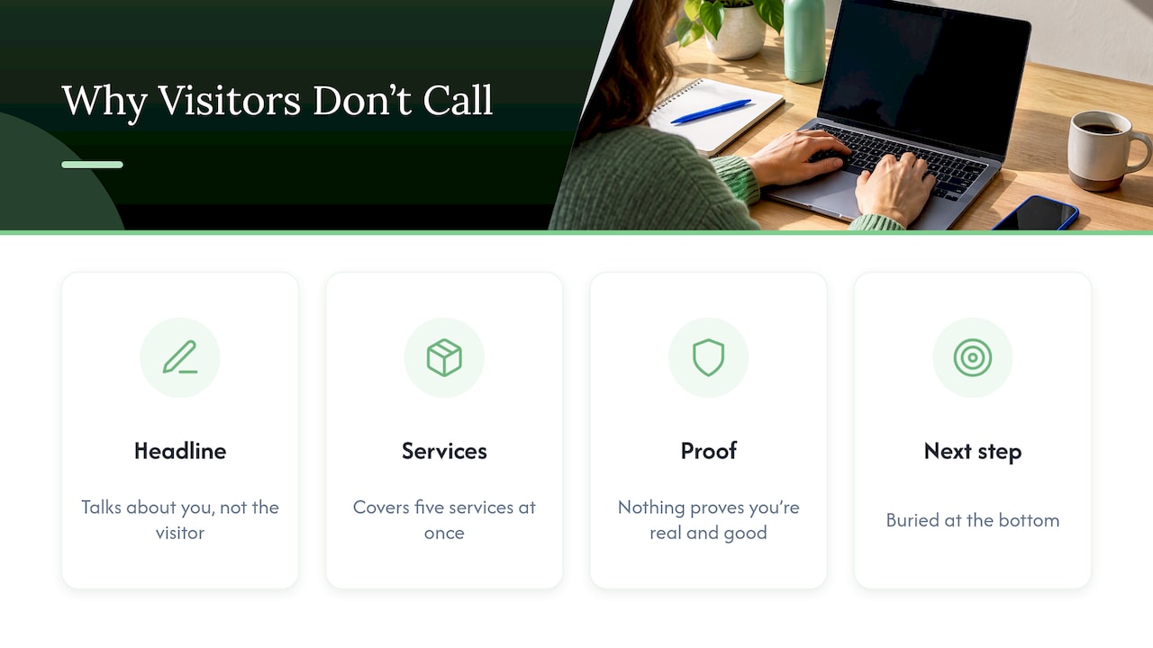
Usually one of four things is happening. The headline talks about you instead of the visitor. The page tries to cover five services at once. There is nothing that proves you are real and good at this. Or the next step is buried at the bottom.
Think about the person on the other end. A homeowner in Hamilton whose furnace just quit is not reading your history. She is scanning for three answers: do you do this, do you serve my area, and how do I reach you now? A dentist searching for a new bookkeeper wants the same speed, just with a calmer tone.
A quick test you can do in 10 seconds: open your page on your phone, look at the first screen only, and ask a friend what you do, where, and what to do next. If they hesitate on any of the three, the page needs work before any amount of advertising will help.
What makes a service page work?
The common thread in good guidance is that a service page moves the visitor from problem to solution to action. SiteGround’s guide lists a benefit-led headline, a problem-focused introduction, service details and benefits, proof points, consistent branding, visual hierarchy and clear calls to action. DreamHost’s guide adds a process explanation, testimonials, pricing guidance, FAQs and low-friction closing actions.
Put in plain order, a page that works usually looks like this:
- A headline that names the result. “Furnace repair in Hamilton, same-day when we can” beats “Our Heating Services.”
- A short line under it. One sentence on who it is for and what happens next.
- One main button. “Call now,” “Book a visit” or “Get a quote,” using the words your customers would use.
- Proof right next to the button. A review, a licence or certification you actually hold, or a photo of your crew.
- The problem, in the customer’s words. Two or three sentences showing you understand the situation.
- What you do and what is included. Short sections, not a wall of text.
- How it works. Three or four steps from first call to finished job.
- Pricing guidance. Even a range or an explanation of how you quote.
- Questions people really ask.
- The same button again.
That is the whole recipe. The rest of this article is about doing each part well.
The first screen: your headline, proof and button
The top of the page does most of the work. A practical layout is a headline, a short subheadline, a primary button and some proof close by. SiteGround Academy recommends a benefit-led headline, a problem-aware introduction, proof points and an action-oriented call to action.
Here is the same service written two ways.
| Weak first screen | Stronger first screen |
|---|---|
| “Welcome to Maple Plumbing Services” | “Leaking pipe? A licensed plumber in Mississauga can be there today” |
| “We offer a wide range of solutions” | “Burst pipes, clogged drains and water heater swaps, priced before we start” |
| Button reads “Submit” | Button reads “Call now” with the phone number visible |
| Stock photo of a handshake | Photo of your own van and technician |
The stronger version is not clever. It is specific. Notice that the example promises only what a business can actually deliver. Never write “same-day” unless you can do it.
If you want to see the headline-and-proof idea applied to a professional firm, this guide to the first impression of a firm’s page walks through turning clicks into long-term clients, and the same principle holds: say who you help and what they get before anything else.
What should the page actually say?
Start with the problem, then the fix
Open the body with two or three sentences describing the customer’s situation. “Your website looks fine, but the phone is quiet” is better than “In today’s competitive market.” Then say what you do about it. Keep paragraphs short, and use headings a skimming reader can follow.
Say what is included and what is not
This is where most small-business pages are thinnest, and where trust is won. Guidance on service pages recommends describing what is included and excluded, naming the dependencies that affect a quote, and giving accurate pricing or explaining how the quote is worked out. A clear list also saves you time, because people who are a poor fit read it and move on.
For example, a landscaping company’s “spring cleanup” page could list: debris removal, bed edging, first mowing, disposal of yard waste. Then: “Not included: tree removal, sod replacement, irrigation repair. Ask us and we will quote these separately.”
Be honest about price
You do not need a full price list. But a range, a starting point or a plain explanation of what changes the cost keeps people from leaving to find someone who will say a number. If you quote jobs, the difference between a quote and an estimate matters a lot to customers, and this explanation of quotes versus estimates for small businesses is a good way to think about scope so the final bill does not surprise anyone.
A sentence like “Most driveway sealing jobs in our area run between X and Y depending on size and prep” does more for trust than a button that says “Contact us for pricing.” Only publish figures you will honour.
Show the process
People fear the unknown. Three or four numbered steps (“1. Call or book online. 2. We visit and quote in writing. 3. We schedule the work. 4. We clean up and walk you through it”) remove that fear. DreamHost’s guide lists explaining the process as one of the elements of a page that converts.
Add proof that a stranger can believe
Proof can be reviews with first names and neighbourhoods, a before-and-after photo, a screenshot of a result, a certification you hold or the number of years you have worked in the area. Use only what is true and that you can show. Never invent testimonials or numbers.
On visuals, DreamHost’s April 2026 guide points to team photos, before-and-after images, result screenshots and process graphics and prefers authentic images over generic stock photography. A phone photo of your real crew in a clean uniform beats a polished picture of strangers.
Service page examples: five sketches by business type
These are illustrative layouts, not real businesses, built to show how the same structure bends to different customers.
The urgent trade (plumber, electrician, HVAC)
The visitor is stressed and on a phone. Put the phone number as a tap-to-call button in the first screen. Name your service area in the headline. Show your licence and insurance if you hold them. Keep the page short, and put emergency hours near the top.
The restaurant or caterer
The visitor wants to picture the food and the price. Lead with a big, honest photo of your own dishes. For catering pages, show sample menus with a per-person range, minimum order size and how far ahead people should book. Put the “request a quote” form directly under the menu.
The clinic or health practitioner
The visitor wants to feel safe and book easily. Lead with who you treat and what to expect at a first visit. Show practitioner photos and credentials. Make booking a single click. If you use an online booking system, connecting it to your site matters; we explain one setup in our page on booking through Jane App on your clinic website.
The professional firm (accountant, lawyer, consultant)
The visitor is comparing a few firms and wants a calm, credible tone. Describe the situations you handle in plain language, explain the first meeting, and say what the intake looks like. Our page on websites and client intake for Ontario firms goes deeper, and our plain guide to content marketing for professional services shows how supporting articles feed those pages.
The non-profit
The visitor wants to know who you help, how, and how to take part. Lead with the people served, show one real story with consent, and offer two clear actions: get help and give help. Keep donation or volunteer buttons from competing with each other.
Making it work on a phone
Most local searches happen on a phone, so design that screen first. Flypaper Magazine’s small-business guidance recommends text readable without zooming, large buttons, key information near the top, and avoiding oversized images, heavy scripts, intrusive popups and autoplay video. It also treats accessibility and mobile performance as basics of conversion, since visitors may be on small screens, in glare, using assistive technology or on a weak connection.
A practical phone checklist:
- The phone number is a tap-to-call button, not plain text.
- Buttons are big enough for a thumb.
- Text is dark on a light background with enough contrast to read outdoors.
- Photos are compressed so the page loads quickly on a weak signal.
- No popup covers the page in the first few seconds.
- Forms ask for name, phone and a short description, and little else.
Test this on a real phone while standing outside in daylight. You will find problems a desktop screen hides.
Adapting the page to your audience
One page cannot speak to everyone. Decide who the page is for and write to that person.
- Homeowners want reassurance, a fast reply and a clear price range.
- Business owners want reliability, references and minimal disruption to their day.
- Property managers want response times, insurance and invoicing terms.
If you serve more than one, give each their own page. A “commercial cleaning” page and a “home cleaning” page rank and convert better than one page trying to do both. Name the places you serve (Ottawa, Barrie, Kitchener, the specific neighbourhoods) so locals know you are nearby. Our local SEO service is built around being found on Google and Maps for exactly these searches.
How do I know if the page is working?
Do not judge a page by how it looks. Judge it by what visitors do. Track:
- Calls from the page (use a call-tracking number or log every call and ask where they found you).
- Form submissions or bookings from the page.
- Visits from search to that page, so you know whether it is being found.
- Share of visitors who take the action. If 200 people visit in a month and 6 contact you, that is 3%. The number matters less than whether it rises after you change something.
Then change one thing at a time: the headline, the button words, the main photo or the order of sections. Wait long enough to see a pattern, usually a month or more for a small site. Changing everything at once teaches you nothing.
Common mistakes to fix first
- A single “Services” page that lists everything in one paragraph each.
- A headline that is only your company name or a generic phrase.
- No visible phone number or booking link.
- Stock photos of people who do not work for you.
- No mention of your service area.
- Pricing hidden behind “contact us” with no explanation at all.
- A form with eight required fields.
- Claims you cannot back up.
Fixing even three of these often changes how the page feels immediately.
A short video idea for this topic
If you want to share this on social media, here is a 45-second version. Hook: “Your service page has about five seconds to answer one question.” Visual: show a real page on a phone with the first screen circled. Example: swap “Welcome to our company” for a headline naming the problem and city. Takeaway: put your headline, proof and one button in the first screen.
Our perspective
Most small businesses we meet do not have a traffic problem first. They have a clarity problem. The page says what the owner does, in the owner’s words, when the customer is searching in theirs.
We build every service page around one question: what would this person type into Google, and what do they need to see to pick up the phone? Because we do all the work in-house, the people who write your page are the same people who design it and set up how it is found, so the message does not get lost between teams.
Our approach is to treat each service as its own page with its own promise, proof and next step, then watch what visitors do and improve it month by month. That is why we favour month-to-month work with direct access to the team over long contracts: a page should earn its keep.
Cristo
Want us to build or fix your service pages?
CloudSprout is an Ontario-based agency that handles websites, local SEO, content and automation in-house. Our plans are published: Sprout is $300 CAD per month, Grow is $600 CAD per month and Scale is $1,200 CAD per month, with one-off setup fees listed on the pricing page. Clients start with a free trial that includes a full digital audit, and our plans are month-to-month with no lock-in contracts.
If you would rather see what we have built first, browse our work, or look at our website development service for how a service page fits into a full site.
FAQ
How long should a service page be?
As long as it takes to answer the questions a buyer has, and no longer. For a simple service that might be 400 to 600 words, and for a complex one with pricing and a process it can be longer. Use short sections and clear headings so people can skim to what they need.
Should I list prices on my service page?
If you can, give at least a range or explain what drives the cost. Visitors who see no figure at all often leave to find someone who gives one. Only publish amounts you are prepared to honour, and say what is and is not included.
Do I need a separate page for every service?
Yes, for your main services. Each page can speak to one customer’s problem, include the right proof and target one set of searches. A single page covering everything is harder to read and harder to find.
What is the first thing to fix on a weak service page?
The first screen. Rewrite the headline to name the problem or result and the place you serve, add one clear button and put one piece of real proof beside it. Check it on your phone before you change anything else.
How do I know if my service page is working?
Count the calls, form submissions and bookings that come from it, and compare them to the number of visitors. Change one element at a time and see whether that rate moves over the following weeks.
Sources
- SEOmatic: Service pages
- SiteGround Academy: How to create a service page that converts
- DreamHost: How to write a services page that converts
- Power of AI: Website service page playbook
- Flypaper Magazine: What a small business website should do
- Firmanager: Quote vs estimate for small businesses
- Ready Accounting: Advertising for accounting firms