

You paid for the ad, or sent the email, or posted the offer. People clicked. Then nothing: no calls, no form fills, no bookings. Good landing page design fixes that gap. A landing page is one page with one job, and the design either makes that job obvious in about five seconds or it doesn’t. For an Ontario plumber, caterer, accountant or non-profit, the winning formula is simple: one clear promise at the top, one action repeated, proof from real customers near the button, and a page that works on a phone first.
Here is the picture worth remembering, and it makes a good 30-second video: open any page you run ads to, hold your phone at arm’s length, and squint. If you can’t tell what the offer is and where to tap, neither can your customer. Everything below is about making that squint test pass.
TL;DR
- A landing page is a standalone page built for one goal, such as a quote request, a booking or a donation, and it works best with no menu pulling visitors elsewhere.
- Put the headline, a short supporting line and the main button on the first phone screen, before any scrolling.
- Use one call to action, worded as the outcome (“Get my quote”), and repeat it two or three times down the page.
- Place real testimonials, ideally from your own city, right next to the button or form.
- Keep it fast, readable and easy to tap: those are accessibility basics and conversion basics at the same time.
Table of Contents
- What is a landing page, and why isn’t my homepage enough?
- What makes a landing page design work?
- Landing page layout: what goes where
- Above the fold: what must be visible without scrolling
- Fewer links, more leads
- What is a good conversion rate for a landing page?
- Design for Canadian customers
- A worked example: a landing page for a home renovation contractor
- Common reasons a landing page doesn’t get leads
- Can you design a landing page yourself, or with an AI tool?
- What we’d do differently: our view
- Want us to build and run it for you?
- FAQ
- Sources
What is a landing page, and why isn’t my homepage enough?
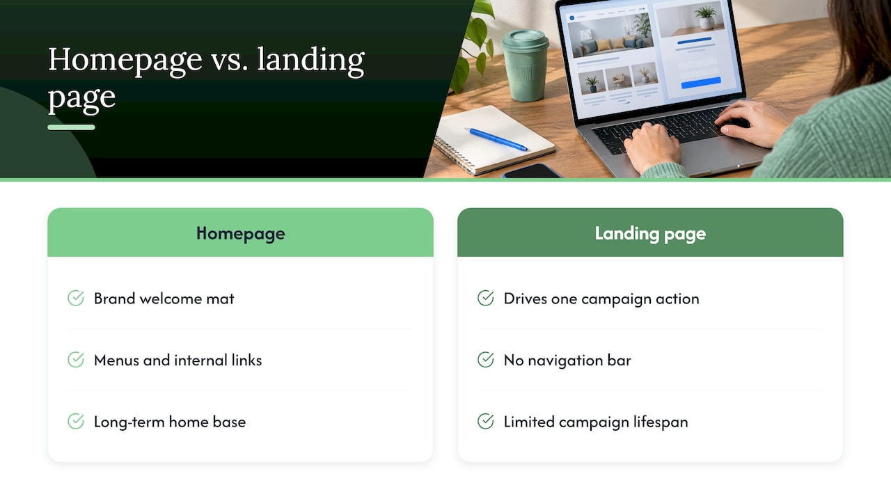
A landing page is a standalone web page made for a marketing or advertising campaign. Constant Contact describes it as the page visitors reach after clicking an ad, email or social post, with every element designed to drive one action. Unlike your main site, it typically has no navigation bar or competing buttons leading in different directions.
Your homepage has a different job. Search Engine Land explains that a homepage is the brand’s welcome mat and internal pages keep their menus and links, while a landing page strips everything back to a single goal and channels attention toward it. Think of the homepage as your shop’s front lobby, with a directory board, and the landing page as the person who meets you at the door and says, “You’re here about the furnace tune-up? This way.”
There is also a lifespan difference. HubSpot notes that a website is a long-term home base, while landing pages drive specific actions for a limited time and are usually updated or removed when the campaign ends. For a small business, that means you can build one landing page per offer: spring AC checks, a catering menu for the holidays, a free consultation for new clients.
Not sure whether you need a landing page or a blog post for what you’re trying to do? We walk through that choice in our blog or landing page decision guide.
What makes a landing page design work?
Strip away the trends and a good landing page does three things for the visitor, in this order. This framing comes from Marketing Mate’s guide for Canadian businesses, which describes three stages in a visitor’s head:
- Understand: What is this offer, and is it for me?
- Evaluate: What do I get, and what should I check before I trust it?
- Act: What do I do next, and what happens after I do it?
Every section of the page needs to serve one of those three jobs. If a section doesn’t, cut it. This is the most useful design rule there is, because it stops you from filling the page with a logo wall, three paragraphs about your history and a photo carousel just because a template had room for them.
The same guide suggests building the page from your customer’s questions rather than from a section checklist. A catering enquiry needs different information from an event registration or a product launch. A homeowner asking for a roofer wants to know your service area, how fast you respond and whether you’re insured. A donor wants to know where the money goes.
Landing page layout: what goes where
A reliable layout for a local service business, top to bottom, looks like this.
1. The hero: headline, subline, button
The hero is the first block a visitor sees. It holds a headline that names the payoff rather than the topic, one supporting line, and the main button. “Furnace repair in Oakville, same-day visits” does more work than “Welcome to Smith Heating.” If you serve a specific area, say so: Ontario customers searching for local help are scanning for their own town.
2. A short “what you get” section
Three to five plain points: what’s included, who it’s for, what it costs or how pricing works. Use short lines, not paragraphs. If you can show a price or a “from” figure, show it. Visitors who have to guess often leave.
3. Proof near the action
dotCanada advises placing at least one testimonial, ideally two or three, near the conversion element. It adds that a testimonial from a customer in the same city as your target audience is especially effective for local service businesses. A review from someone in Burlington or Barrie beats a vague five-star graphic.
Specifics also help higher up the page. IvyForms reports that proof above the fold, for example a line like “4.8 out of 5 from 312 customers”, converts meaningfully better than generic star graphics. Only use numbers you can back up with your own real reviews.
4. How it works
Two to four steps: you call or fill in the form, we confirm within a stated time, we come on site. This answers the “what happens after?” worry that stops people from clicking.
5. The call to action, repeated
The same dotCanada guide recommends one primary call to action repeated two or three times as the visitor scrolls, with every button and form pointing to the same action. Don’t offer “call us,” “download our brochure” and “follow us on Instagram” all at once. Pick the one action that makes you money and let it win.
6. A short FAQ and a final nudge
Five questions at most, covering the objections you hear on the phone: price, timing, service area, guarantees. Finish with the same button one more time.
Above the fold: what must be visible without scrolling
“Above the fold” is an old newspaper term. On a web page it means whatever shows before the visitor scrolls. On a phone, that is a small space, so it’s worth being strict about it.
Mobirise’s design rules say a phone landing page should show the headline, subheading and button before any scrolling. If a large image pushes the button down, shrink the image, not the text. The IvyForms formula adds a supporting visual and, where the page has a form, the form itself: headline, subhead, form and visual all visible at once. The same page cites Nielsen Norman Group eyetracking showing roughly 57% of viewing time lands above the fold, which is why that first screen carries so much weight.
A quick checklist for the first screen on a phone:
- A headline that says what you do and where.
- One line that adds the strongest reason to choose you (response time, guarantee, years in business, if true).
- A button or short form, in view, with outcome wording.
- A tap-to-call number if phone calls are how you close work.
- One real photo of your team or work, small enough not to push the button down.
Button words that get clicked
Mobirise recommends naming the outcome: “Get my quote” or “Book a visit” rather than “Submit” or “Learn more”. Marketing Mate adds a warning worth taping to your monitor: don’t label a button “Book now” if it only sends an unconfirmed enquiry. Say what really happens (“Request a callback”), and test the full journey yourself: the button, the form, the confirmation message and the email you receive.
Fewer links, more leads
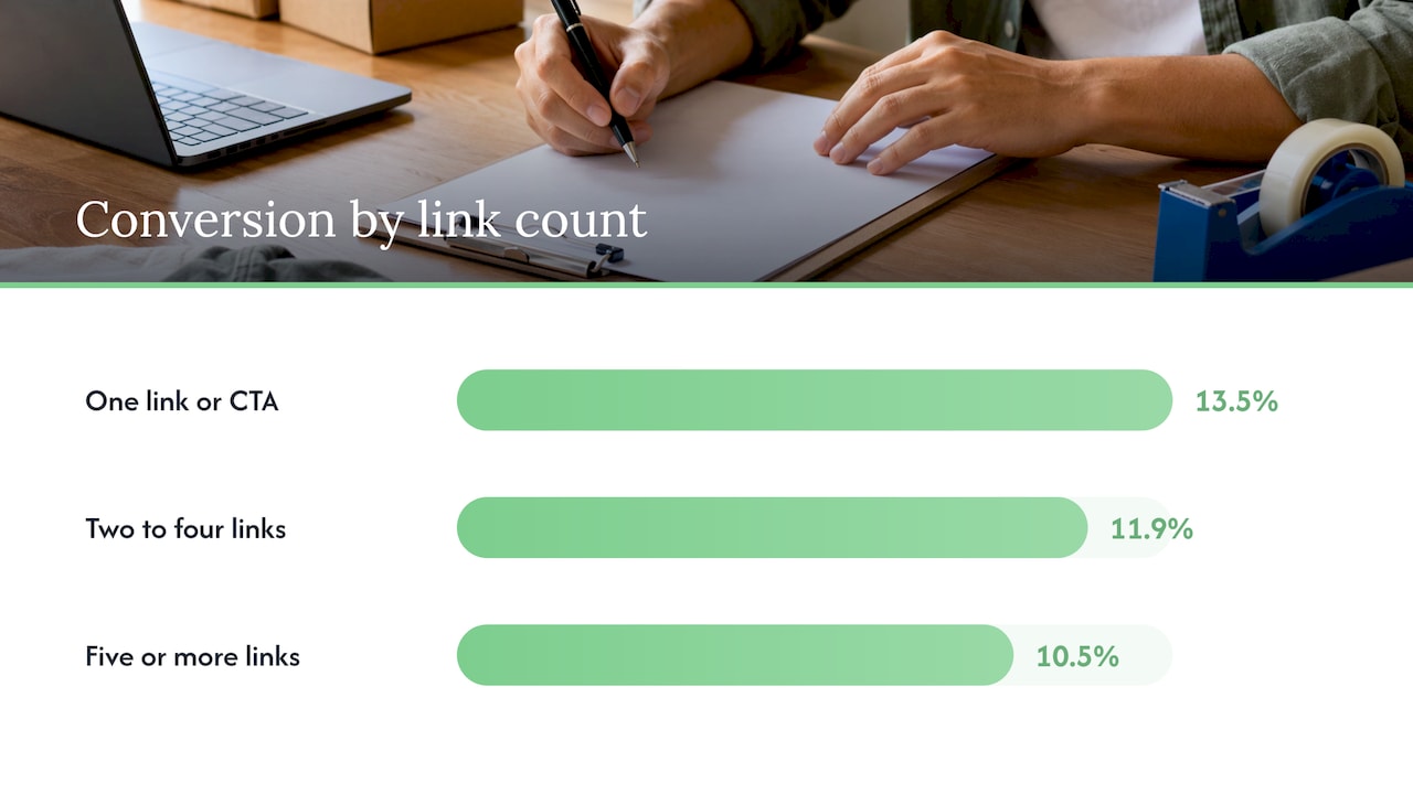
The biggest design decision on a landing page is what you remove. IvyForms, summarizing an Unbounce analysis of 18,639 pages, reports that pages with a single link or call to action converted at 13.5%, two to four links at 11.9%, and five or more at 10.5%. The takeaway for a small business is practical: take out the top menu, the footer link list and the social icons on pages you send paid traffic to. Every extra clickable thing is a door out.
That doesn’t mean a landing page should feel bare. It means every element earns its place.
What is a good conversion rate for a landing page?
Be careful with benchmarks, because they vary by industry, offer and traffic source. The same IvyForms write-up cites Unbounce’s analysis of 41,000 pages and 464 million visitors, with a median conversion rate of 6.6% across industries and industry medians ranging from 3.8% to 12.3%. Treat that as a rough compass, not a grade.
Your own number matters more. Count how many people visit the page, how many call or submit the form, and track that month over month. A local service page sending 200 visitors that produces 10 enquiries is converting at 5%. If you change the headline and the next 200 visitors produce 16, you have learned something real.
Design for Canadian customers
Local signals reduce doubt. NeoAgora’s guide for Canadian small businesses lists several: a Canadian phone number and address, prices shown in Canadian dollars, Canadian shipping policies and trust marks such as security certificates or professional associations. For an Ontario trade business, add the cities you serve, your licence or association membership if you hold one, and a photo of your actual truck or crew.
The same guide notes that over 85% of Canadians use smartphones, so aim for pages that load in under three seconds, with thumb-friendly buttons, simple navigation and readable fonts. Shopify’s Canadian guide to high-converting landing pages backs the same direction: simple usability, clear copy and calls to action, less clutter, fewer steps or clicks, and trust signals such as return policies and recognizable payment icons.
Accessibility is part of good design
In Ontario, the AODA (Accessibility for Ontarians with Disabilities Act) requires businesses and non-profits with 50 or more employees to make public websites meet WCAG 2.0 Level AA, a requirement in force since January 1, 2021 according to P4 Emachines. WCAG is the international set of web accessibility guidelines. Smaller businesses aren’t covered by that rule, but the practices help every visitor, including the person squinting at your page on a phone in sunlight.
Three basics, using the newer WCAG 2.2 numbers Mobirise lists:
- Text contrast of at least 4.5:1 for normal text and 3:1 for large text, so light grey on white is out.
- Tap targets of at least 24 by 24 CSS pixels, so buttons can be hit with a thumb.
- Visible labels on every form field, not just placeholder text that disappears when someone starts typing.
For a longer list of fixes, see our guide to website accessibility for Ontario small businesses.
A worked example: a landing page for a home renovation contractor
Imagine a Mississauga bathroom renovator running a local ad for free in-home quotes. Here is how the page could be built with the layout above.
- Headline: “Bathroom renovations in Mississauga, with a free in-home quote.”
- Subline: A single sentence on timelines or what the quote includes, using only facts the business can stand behind.
- Button: “Book my free quote,” with a short form below asking only for name, phone, postal code and a one-line project description.
- Proof: Two reviews from Mississauga and Oakville customers, with first names and project type, right beside the form.
- What you get: Four bullet points: site visit, written quote, timeline, warranty terms as the business states them.
- How it works: Book, visit, quote, start date.
- Repeat: The same button after the steps and again at the bottom.
There’s no menu, no blog link and no social icons. If a visitor wants to learn more about the company, a single small “About us” link in the footer is a judgment call, but the page’s real job is the quote request.
Notice that the form is short. Every extra field is another reason to stop. Ask only for what you need to take the next step, and collect the rest on the phone.
Common reasons a landing page doesn’t get leads
If your page already exists and the results are flat, work through these in order. They are the most common causes.
- The headline describes you, not the visitor’s problem. Rewrite it around what they get.
- The ad promises one thing and the page says another. Match the wording of the ad to the headline.
- The button is below the first phone screen. Shrink the image.
- There are too many choices. One action only.
- No proof. Add real reviews near the form.
- The form is long. Cut it down.
- The page is slow or hard to read on a phone. Test it on your own phone, on mobile data, not on office Wi-Fi.
If this list sounds like your whole website and not just one page, our article on seven fixes for a website that isn’t converting goes deeper, and how to design a service page that makes visitors call covers the page people reach from search rather than from ads.
Can you design a landing page yourself, or with an AI tool?
Yes, you can draft one in an afternoon, and the layout in this article is enough to start. The harder part is the wiring: making the form reach you, sending an instant confirmation, following up on every enquiry and seeing which ad produced which lead. If you want the enquiry to land in a CRM (a customer relationship management system, basically a shared list of every lead and what happened to it) with automatic follow-up, see how we handle CRM, booking and follow-up for small businesses.
What we’d do differently: our view
Most small business owners come to us saying, “My website isn’t getting leads.” When we look at the pages they send traffic to, the story is rarely about colours or fonts. It’s about too many choices and no clear next step.
Our view is that a landing page is a small piece of a bigger system: the ad or search listing that earns the click, the page that earns the enquiry, and the follow-up that earns the job. When those are handled by different people who never talk to each other, things fall through the gaps. That’s why we do web design, SEO, content, social media, automation and AI employee systems in-house, with no outsourcing, and why our clients can talk directly to the people doing the work.
We also think you shouldn’t have to sign your business away to find out whether it works. Our plans are month-to-month with no lock-in contracts, and we start with a free trial that includes a full digital audit, so you see what’s holding your pages back before you commit to anything.
Cristo
Want us to build and run it for you?
If you’d rather spend your time on customers than on page layouts, we build custom websites and landing pages for owner-operated businesses across Ontario and Canada. Our Sprout plan is $300 CAD per month, with a one-off setup fee of $500 to $1,500 CAD. Grow is $600 CAD per month with setup of $1,500 to $3,500 CAD, and Scale is $1,200 CAD per month with setup of $3,500 to $7,500 CAD. Plans are month-to-month, and you start with a free trial and full digital audit.
See the plans and pricing, look at websites and systems we’ve built, or read about our website development service.
FAQ
What is the best layout for a landing page?
Start with a hero holding the headline, one supporting line and the main button. Follow with what the visitor gets, proof such as testimonials, a short how-it-works section, then the same call to action again. Every section should help the visitor understand, evaluate or act, and anything that doesn’t should be removed.
How long should a landing page be?
As long as it takes to answer the questions a buyer has before acting, and no longer. A simple quote request for a local service can work on a few screens. A higher-priced or less familiar offer needs more explanation and proof. Repeat the button every two or three screens so no one has to scroll back up.
Should a landing page have a navigation menu?
Usually not. A landing page has one goal, and a full menu gives visitors other places to go. IvyForms, citing an Unbounce analysis, reports that pages with a single link or call to action convert better than pages with five or more. Keep the logo, the main button and, if you need it, a phone number.
Do small businesses in Ontario have to make landing pages accessible?
Under the AODA, businesses and non-profits with 50 or more employees must meet WCAG 2.0 Level AA on public websites, while smaller organizations aren’t legally covered by that requirement, as P4 Emachines explains. Even so, readable contrast, big tap targets and labelled form fields help every visitor and are easy to build in from the start.
What’s the difference between a landing page and a homepage?
A homepage introduces your whole business to anyone, with a full menu, and stays up permanently. A landing page serves one campaign audience with one action and is often temporary. Constant Contact’s comparison puts it plainly: one specific action versus a broad introduction.
Sources
- What Is a Landing Page? Constant Contact
- What Is a Landing Page? Search Engine Land
- Landing Page vs. Website: What’s the Difference? HubSpot
- High Converting Landing Pages: 8 Best Practices, Shopify Canada
- Homepage Design: A Section-by-Section Blueprint, P4 Emachines
- Creating High-Converting Landing Pages for Canadian Small Businesses, NeoAgora
- Landing Page Design: Rules, Examples & Builders, Mobirise
- Lead Magnet Landing Page Examples That Convert Past 20%, IvyForms
- Creating Effective Landing Pages for Your Canadian Business, dotCanada
- What Should a Landing Page Include? Marketing Mate